IGI Brand Guidelines

Resources
IGI Brand Guidelines
Our Brand
This page is a simple guide to using IGI brand elements correctly.
Whether you’re an IGI member, a partner, or a member of the media, we appreciate your help in using our brand consistently and thoughtfully. If you have any questions or need any assistance, please contact igi-press@berkeley.edu.
Our Name
When referring to the institute, please use “Innovative Genomics Institute” or “IGI” when space is limited.
In a sentence, we use “the” before both versions of our name, e.g.:
- Welcome to the Innovative Genomics Institute.
- We are thrilled that you are interested in our work at the IGI.
Our Logo
We are proud of our logo, and we ask that you follow these guidelines to ensure it always looks its best. Our logo is the combination of a simple wordmark with the icon.
Master Logo
The master logo is made up of the right-handed helix icon and the Innovative Genomics Institute wordmark.
To ensure legibility and impact, our logo should never be reproduced smaller than 70px in any digital communication, and should appear on a clear, white background whenever possible.
Logomark
Under certain circumstances we prefer to simply use the icon on its own instead of the full logo.
Examples of this would be social media avatars and where the application is smaller than the recommended size to display the full logo.
While the icon can exist without the wordmark, the wordmark should never exist without the icon.

Minimum Size
For readability, scale needs to have special attention. It is not recommended to use brand elements below the following values.
Whitespace
The whitespace around the brand elements is extremely important. It helps to keep things clean and professional. The minimum whitespace around the elements is equivalent to half of the mark size, but give them room to breathe whenever possible.
Logo Misuse
It is important that the appearance of the logo remains consistent. The logo should not be misinterpreted, modified, or added to. No attempt should be made to alter the logo in any way. Its orientation, color, and composition should remain as indicated in this guide. Some of the more common mistakes are shown below — please avoid these.
IGI Program Logos
The IGI program logos are designed to identify and distinguish the key programs from each other, while clearly tying them in with the overall IGI brand.
Each logo should be used whenever clear delineation is needed to distinguish a specific program in communications materials, on the web, and on physical products. The logos should rarely appear without also being accompanied by the IGI logo.


Typography
Our Typefaces
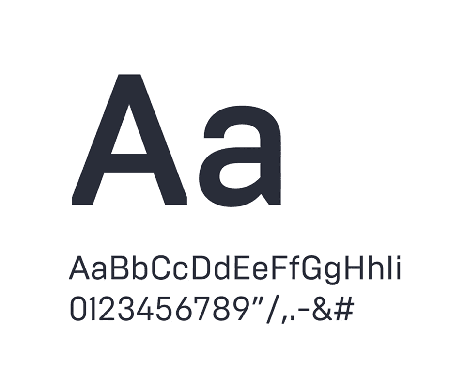
Brutal Type
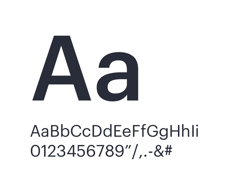
Graphik
Type Specimen
The Innovative Genomics Institute
H1
Brutal Type Regular 62pt
A Partnership Between UC Berkeley and UCSF
H2
Brutal Type Regular 36pt
Advancing genome research for a better world
H3
Graphik Medium 20pt
We believe in the potential of genome engineering to solve some of humanity’s greatest problems.
H4
Graphik Regular 16pt
The Innovative Genomics Institute is composed of diverse researchers with a powerful combined expertise.
Body
Graphik Medium 16pt
“Scientific advances in molecular biology over the past 50 years have produced remarkable progress in medicine.”
Quote
Graphik Medium 30pt
The discovery of CRISPR-Cas9 revolutionized the field of genome editing.
Caption
Graphik Regular 15pt
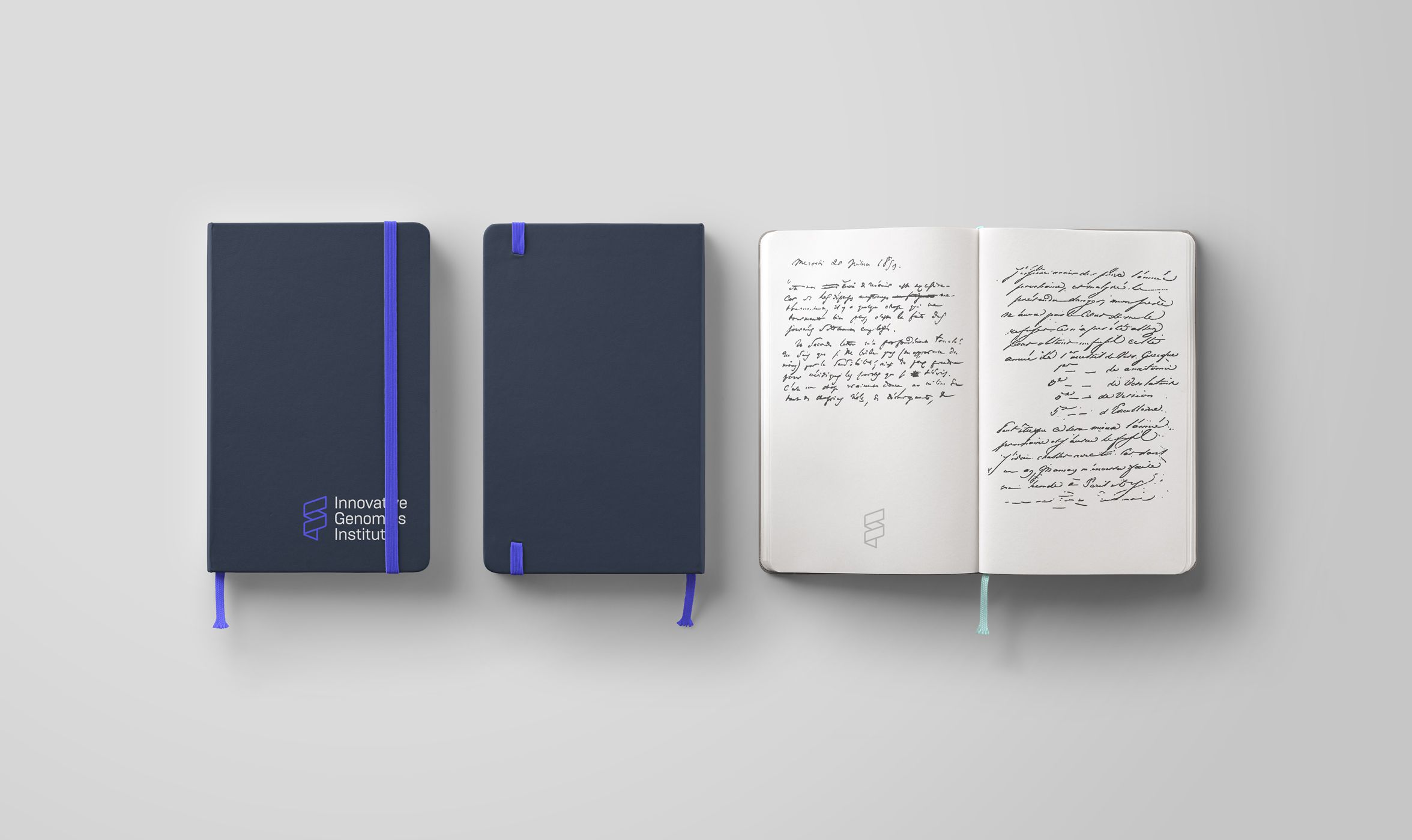
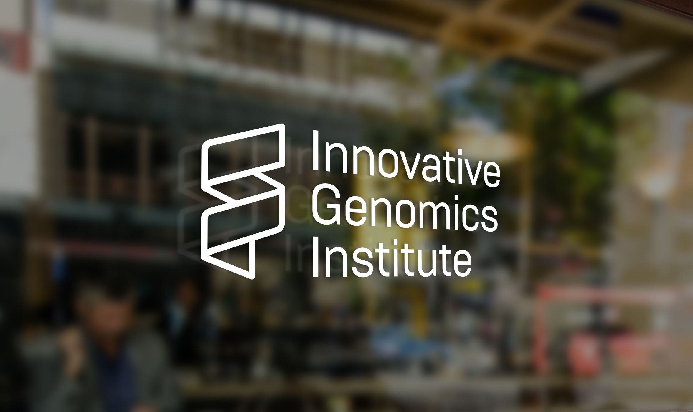
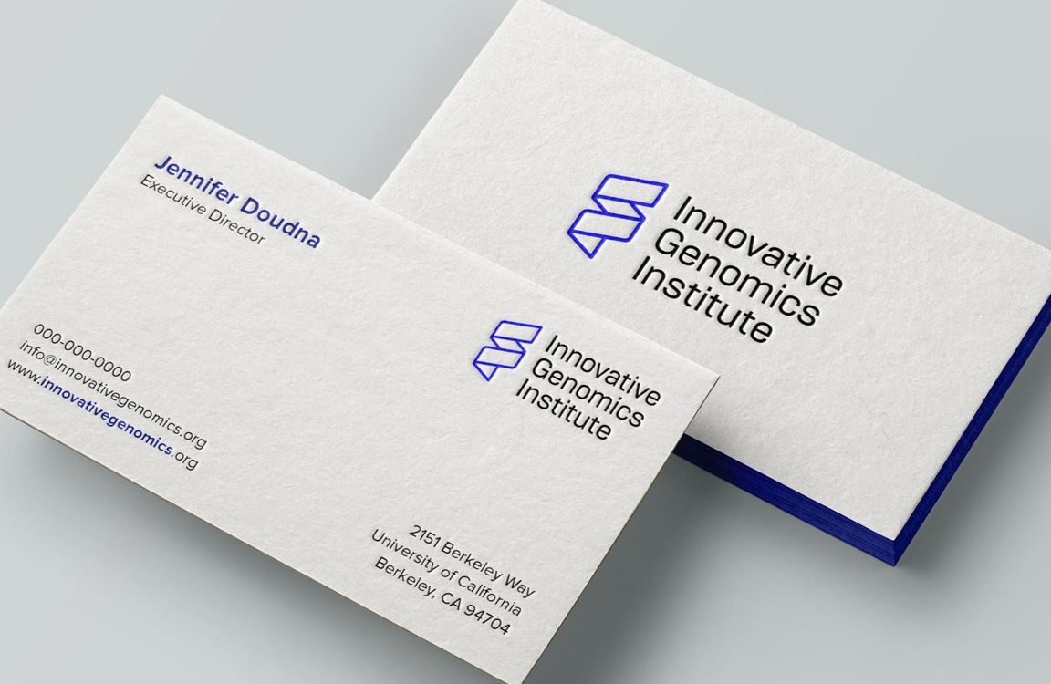
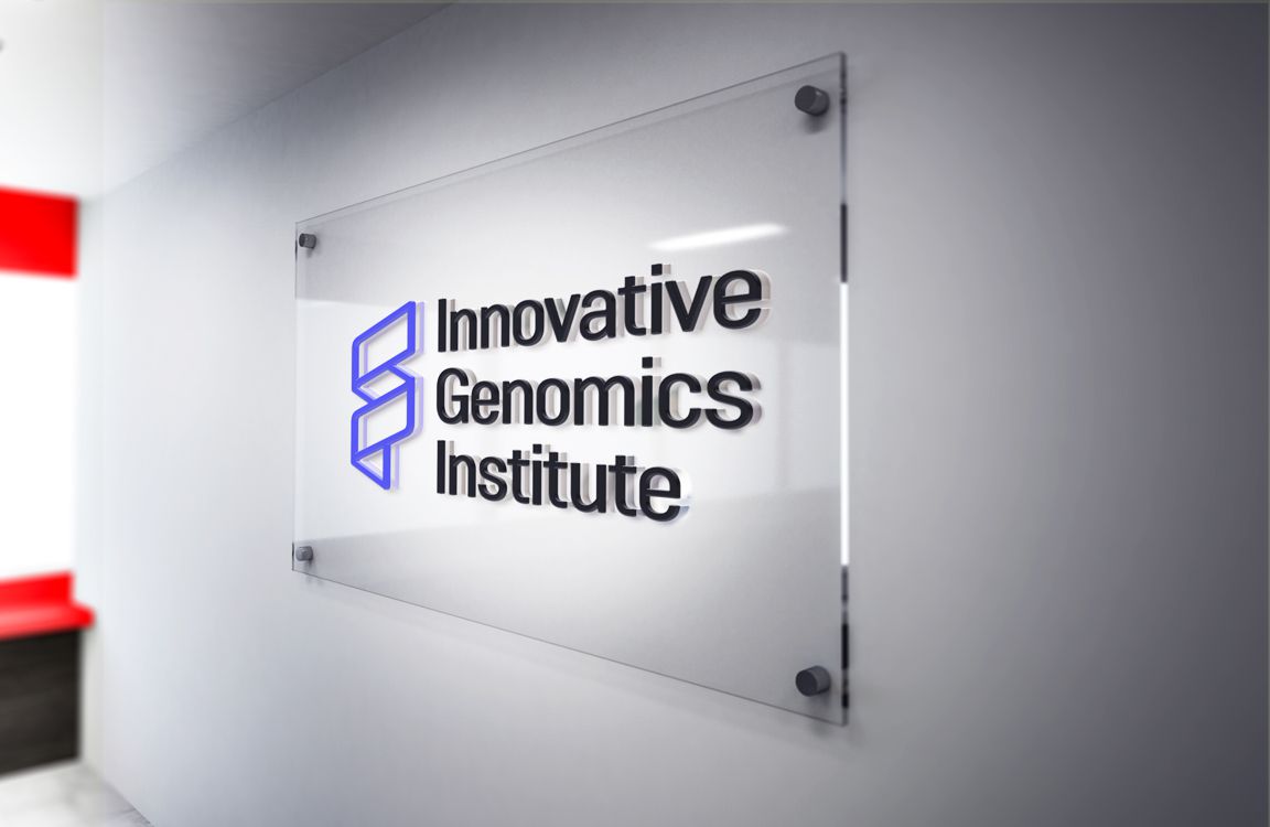
Example Applications

Our colors
These are the primary and complementary colors of the brand. Make sure to always use these exact color codes, either for screens or print. Hover your cursor over the subcolors to view their color codes.
rgb 137 141 249
rgb 188 190 251
rgb 238 238 254
#5857FF
RGB 88 87 255
CMYK 75 52 0 0
PANTONE 2130
rgb 105 108 115
rgb 170 171 175
rgb 233 234 235
#292D39
RGB 41 45 57
CMYK 94 76 12 35
PANTONE 2767
rgb 232 232 232
rgb 247 247 247
#D8D8D8
RGB 216 216 216
CMYK 4 3 6 7
PANTONE COOL GRAY 1
IGI Program Colors
Each IGI program has its own unique primary color. Secondary palettes for each program remain the same.
#EC5121
RGB 236 81 33
CMYK 0 68 76 0
PANTONE 2026
#96C04B
RGB 150 192 75
CMYK 65 0 100 0
PANTONE 368
#FFAC0F
RGB 255 172 15
CMYK 0 38 100 0
PANTONE 130
#7ACBC8
RGB 122 203 200
CMYK 48 0 10 0
PANTONE 630
Color Usage
The IGI color palette has been designed for use with both print and digital applications. Please reference the table below for determining the correct color usage.
| Design elements for screen | RGB, HEX |
| Printed materials | Pantone, CMYK |
| PPT presentations | RGB, HEX |
| PDFs for print | Pantone, CMYK |
| PDFs for website viewing or digital download | RGB, HEX |
| Social media avatars | RGB, HEX |
| Electronic newsletters or announcements | RGB, HEX |
| Display graphics/kiosks | Pantone, CMYK |
Printing
Use this list to ensure your print projects are up to brand standards. This section can be your starting point for any printed materials projects – posters, fliers, brochures, handouts, etc. Easy-to-use, branded templates built in PowerPoint are available for posters.
| When possible, use Pantone values for the most accurate color matching. |
| Make sure all artwork is provided in a CMYK format. Files provided in RGB format will be converted into CMYK before print and will result in some color differences from the original design. |
| Ensure all fonts are ‘embedded‘ or ‘outlined.’ |
| Ensure all images and graphics are above ‘300 dpi.’ If your images look blurred or pixelated then chances are they are not quite good enough quality. |
| Always use vector versions of our logos to ensure the best quality. |
| Ensure all artwork has a 3 mm bleed around the edges. If your artwork doesn’t have a bleed, the artwork may have white edges. |